Addressing the Hurdles of Complex Vector Graphics Details
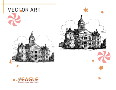
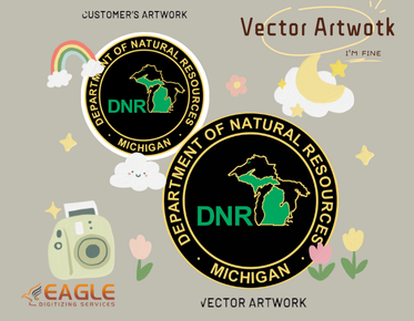
Vector graphics possess a mesmerizing allure, showcasing crisp lines and infinite scalability that captivates designers and viewers alike. However, their elegance often belies an underlying complexity that can present challenges, especially when dealing with intricate contours and fine details. This article delves into the hurdles faced while working with complex vector designs and offers insights and strategies to navigate these obstacles, ultimately enhancing the creative process. For the top-notch online vector conversion, don't hesitate to get in touch with us.
Understanding Complex Contours and Details
What Are Complex Contours in Vector Graphics?
Complex contours in vector graphics refer to the intricate paths and shapes that define an image. These contours can be curvaceous, angular, or a combination of both, creating a rich tapestry of forms. Unlike simple geometric shapes, complex contours demand a higher level of precision and care. They often serve as the foundation for elaborate designs, making their management crucial for achieving a polished final product.
The Importance of Detail in Graphic Design
Detail is the heartbeat of graphic design. It conveys emotion, sets the mood, and directs the viewer's gaze. In vector graphics, detail can transform an ordinary image into a striking piece of art. However, it’s a double-edged sword. While intricate details can enhance visual appeal, they can also complicate the design process, necessitating a careful balance to ensure that clarity is not sacrificed for complexity.
Common Challenges with Complex Contours
The Struggle with Overlapping Paths
One of the most prevalent challenges in working with complex contours is managing overlapping paths. As layers accumulate, paths may intersect, creating visual confusion and complicating the design. This overlap can lead to unintended visual artifacts, which detract from the overall clarity of the artwork. Identifying and addressing these overlaps early in the design process is essential for maintaining a cohesive look.
Managing Precision in Intricate Designs
Precision is paramount in intricate designs, yet achieving it can be daunting. The smallest miscalculation in anchor points or paths can result in skewed shapes and lost details. Designers must develop a meticulous eye, ensuring that every contour is accurate and every curve flows seamlessly into the next. The challenge lies in the balance between artistic expression and technical precision.
Issues with Scaling and Resolution
Scaling vector graphics should theoretically pose no problem due to their inherent nature. However, when complex contours and details are involved, scaling can introduce unforeseen issues. When resized, intricate details may become too fine or distorted, leading to a loss of impact. Understanding how to manage resolution and scaling during the design process is crucial for achieving the desired visual effect.
Tools of the Trade: Software for Complex Vector Graphics
Overview of Popular Vector Design Software
Various vector design software options are available, each equipped with features that cater to the needs of designers tackling complex graphics. Adobe Illustrator is a heavyweight contender, renowned for its versatility and comprehensive toolset. CorelDRAW and Affinity Designer also offer robust features, making them suitable alternatives for both beginners and seasoned professionals. Choosing the right software is the first step toward successfully managing complexity in vector graphics.
Key Features to Look for in Vector Graphic Tools
When selecting vector graphic tools, look for features that simplify the handling of complex designs. Tools such as path simplification, precise anchor point manipulation, and advanced layering capabilities are invaluable. A user-friendly interface and customization options can also enhance productivity, allowing designers to focus on creativity rather than technical hurdles.
Preparing Your Workspace for Success
Organizing Layers for Easier Navigation
An organized workspace can significantly streamline the design process. Properly naming and categorizing layers allows for easier navigation, particularly when dealing with intricate designs. Grouping related elements together ensures that adjustments can be made efficiently without losing sight of the overall composition. This organizational structure is key to managing complexity effectively.
Setting Up Guidelines to Manage Complexity
Guidelines serve as navigational aids that can help manage complexity in vector graphics. They provide a visual reference for aligning elements and maintaining consistent spacing throughout the design. Utilizing guidelines can alleviate confusion, making it easier to focus on the intricate details of the design while ensuring that the overall composition remains balanced.
Techniques for Simplifying Complex Contours
How to Use Simplification Tools Effectively
Vector design software often includes simplification tools that can reduce the number of anchor points and paths without sacrificing detail. These tools can streamline intricate designs, making them easier to manage and edit. When employed judiciously, simplification can enhance the overall clarity of the graphic while preserving its artistic intent.
Identifying and Removing Unnecessary Points
Another effective technique for simplifying complex contours is identifying and removing unnecessary anchor points. By minimizing the number of points along a path, designers can create smoother lines and reduce visual clutter. This process enhances the overall readability of the design, allowing intricate details to shine through without overwhelming the viewer.
The Art of Tracing: From Raster to Vector
Techniques for Accurate Tracing of Complex Designs
Tracing is an art form in its own right, particularly when converting raster images into vector graphics. Accurate tracing requires patience and a keen eye for detail. Techniques such as the use of bezier curves and the pen tool can help capture the essence of intricate designs while maintaining clarity. The goal is to replicate the original artwork without losing its character in translation.
Balancing Detail with Simplicity During Tracing
During the tracing process, striking a balance between detail and simplicity is essential. While it's tempting to replicate every nuance of the original image, doing so can lead to an overcrowded design. Instead, focus on the key elements that define the piece. By prioritizing essential details, the final vector graphic can maintain clarity and visual impact.
Using Layers to Tame Complexity
Advantages of Layered Designs in Managing Details
Layers are a designer's best friend, especially when navigating complex contours. By segregating different design elements, layers allow for focused adjustments without affecting the entire composition. This flexibility is invaluable when fine-tuning intricate details or experimenting with various design aspects.
Strategies for Layer Organization
To maximize the advantages of layered designs, develop a strategy for organizing layers. Group similar elements together and create a logical hierarchy that reflects the design's structure. Use color coding or naming conventions to differentiate layers easily. An organized layer structure fosters a smooth workflow, reducing frustration and enhancing productivity.
Working with Colors and Gradients in Detailed Graphics
Color Management: Keeping It Clean and Cohesive
Color management is critical in vector graphics, particularly when dealing with complex details. A cohesive color palette enhances visual unity and reinforces the design's message. Utilize color swatches and harmonies to maintain consistency, ensuring that each element complements the overall aesthetic. This approach not only enhances clarity but also elevates the sophistication of the design.
Gradient Techniques for Complex Contours
Gradients can add depth and dimension to complex contours, but they must be used judiciously. Gradients should enhance, not overshadow, the underlying design. Employ techniques such as smooth transitions and strategic placement to create a sense of depth without sacrificing clarity. By mastering gradient techniques, designers can enrich their visuals while preserving the integrity of the design.
Mastering the Use of Paths and Anchors
Understanding Anchor Points and Their Importance
Anchor points are the building blocks of vector graphics, serving as pivotal control points for paths. A thorough understanding of how to manipulate these points is essential for achieving clean lines and precise curves. Mastering anchor points allows designers to refine their work and create visually stunning graphics that resonate with viewers.
How to Adjust Paths for Cleaner Lines
Adjusting paths is a critical skill for any designer working with vector graphics. Techniques such as direct selection and path simplification can enhance line quality. Focus on achieving smooth curves and consistent angles, which contribute to the overall professionalism of the design. Cleaner lines lead to sharper visuals that leave a lasting impression.
Troubleshooting Common Issues with Contours
Diagnosing Problems in Complex Vector Designs
When working with complex contours, problems can arise unexpectedly. Diagnosing these issues requires a keen eye and a methodical approach. Whether it's an overlapping path, a misaligned anchor point, or a scaling issue, identifying the root cause is the first step toward an effective solution.
Effective Solutions for Overlapping Shapes
Overlapping shapes can create visual confusion and diminish the impact of the design. To address this issue, consider employing pathfinder tools to unite or subtract overlapping elements, resulting in a cleaner composition. Alternatively, strategically placing elements can help alleviate overlap while maintaining the intended aesthetic.
Enhancing Detail Without Overcomplicating
Balancing Detail with Clarity: Best Practices
While detail is essential, maintaining clarity is equally crucial. Best practices for balancing these elements include prioritizing key design features and eliminating unnecessary clutter. Focus on the aspects that elevate the design while ensuring that the overall message remains clear and impactful.
When Less is More: Knowing When to Simplify
Sometimes, the most powerful designs are the simplest. Knowing when to simplify is an invaluable skill for any designer. Embrace the philosophy that less is more, and don’t be afraid to strip away excess elements that detract from the core message of the design. Simplifying can enhance clarity and allow the viewer to focus on what truly matters.
Using Patterns and Textures to Add Depth
How to Incorporate Textures in Complex Graphics
Textures can introduce a tactile quality to vector graphics, enriching the visual experience. When incorporating textures into complex designs, consider the context and purpose of the texture. A well-placed texture can add depth without overwhelming the primary elements of the design. Experiment with different blending modes and opacities to find the right balance.
The Role of Patterns in Enhancing Visual Interest
Patterns serve as an engaging tool for adding visual interest to designs. When used thoughtfully, they can enhance the overall composition and create a sense of rhythm. Integrate patterns subtly, ensuring they complement rather than compete with the intricate details of the design. The right pattern can elevate a piece, making it more captivating and memorable.
Exporting Complex Vector Graphics
Best Practices for Exporting Without Losing Detail
Exporting complex vector graphics requires attention to detail to ensure that the final product retains its quality. Opt for the appropriate file format and settings that align with the intended use. Familiarize yourself with export options to maintain the integrity of the design while achieving the desired file size.
Choosing the Right File Formats for Complex Designs
Different file formats serve different purposes. When dealing with complex designs, SVG is ideal for web use due to its scalability, while EPS and PDF formats are better suited for print. Understanding the nuances of each format can help ensure that your designs translate effectively across various platforms.
Navigating the complexities of intricate vector graphic details is essential for achieving stunning visual outcomes. By employing effective techniques and tools, designers can overcome these hurdles, ensuring precision and clarity in their work. Embracing these strategies not only enhances the quality of complex designs but also empowers artists to unleash their full creative potential. If this post piqued your curiosity and you wish to learn more about convert to vector online, feel free to reach out to us.


