Embroidery Thread Selection: Choosing the Perfect Colors
Embroidery is a timeless craft that allows individuals to transform plain fabrics into works of art using needle and thread. One of the most crucial aspects of embroidery is thread selection, particularly when it comes to choosing the perfect colors. The colors you choose can make or break your embroidery project, affecting its visual appeal and overall impact. In this detailed guide, we'll explore the art of embroidery thread selection, tips for picking the right colors, and how to create stunning embroidered pieces that capture attention and imagination.
The Importance of Thread Selection
Thread selection is an art form within the art of embroidery. The choice of thread colors can significantly influence the final appearance of your embroidery, and here's why it matters:
● Visual Impact: The colors you choose will determine how eye-catching and visually
appealing your embroidery project is. The right combination can make your
design pop, while the wrong choices can lead to a lackluster result.
● Emotional Resonance: Colors have the power to evoke emotions and moods. Selecting the right
colors can convey the intended emotions or messages of your design.
● Harmony and Balance: Thread selection plays a crucial role in achieving balance and harmony
in your embroidery. The right colors will complement each other and the fabric,
creating a pleasing overall look.
● Accurate Representation: If you're embroidering a design that should resemble real-life objects
or scenes, choosing accurate colors is essential for realism and recognition.
● Personal Expression: Thread colors allow you to infuse your personal style and creativity into your embroidery projects, making them uniquely yours.
Now, let's delve into the steps for selecting the perfect embroidery thread colors.
Understanding Color Theory
Before you start choosing thread colors, it's helpful to have a basic understanding of color theory. Color theory explores how colors interact with each other and how they can be combined to create visually appealing compositions. Key concepts in color theory include:
● Color Wheel: The color wheel visually illustrates primary, secondary, and tertiary
colors. It helps you understand color relationships and how colors harmonize or
contrast with each other.
● Complementary Colors: Complementary colors are color pairs positioned directly opposite each
other on the color wheel, like red and green or blue and orange. Using
complementary colors in embroidery can create striking contrast.
● Analogous Colors: Analogous colors are groups of colors that are adjacent to each other
on the color wheel, like red, orange, and yellow. Analogous colors can create
an appealing and harmonious appearance.
● Warm and Cool Colors: Colors are often categorized as warm (e.g., red, orange, yellow) or
cool (e.g., blue, green, purple). Understanding the temperature of colors can
help you convey specific moods or emotions in your embroidery.
● Color Harmony: Achieving color harmony involves selecting colors that work well together and create a pleasing overall composition. Harmonious color schemes include complementary, analogous, and monochromatic color schemes.
Tips for Choosing Embroidery Thread Colors
Now that you have a grasp of color theory, let's explore practical tips for choosing embroidery thread colors:
1. Consider the Project's Purpose
The colors you choose for your embroidered project should based on the intended purpose. Is it a decorative piece, a gift, or something functional like a garment or home decor? Consider the context in which the embroidery will be displayed, as this will influence your color decisions.
● Decorative Pieces: For decorative embroidery, you have more creative freedom. Choose
colors that resonate with your personal style or the aesthetics of the space
where the embroidery will be showcased.
● Gifts: If you're creating embroidered gifts, think about the recipient's
preferences and the occasion. Personalize the colors to suit their taste or
convey a specific message.
● Functional Items: Functional items like clothing or accessories may require more practical color choices. Consider the wearer's wardrobe and the versatility of the colors.
2. Analyze the Design
Examine the embroidery design you plan to work on. Take note of the various elements within the design, such as main motifs, background details, and text. Consider the following factors:
● Main Motifs: Identify the primary elements of the design. These should be the focal
points and may require bold or contrasting colors to stand out.
● Background: Determine if there's a background or surrounding area in the design.
Background colors should complement and enhance the main motifs without
overpowering them.
● Text and Lettering: If your design includes text or lettering, select colors that ensure
readability and legibility.
● Complexity: Assess the complexity of the design. Elaborate designs with intricate details may benefit from a well-balanced color palette, while simpler designs may call for a more straightforward approach.
3. Consider the Fabric
The type and color of the fabric you're embroidering on can significantly impact your thread color choices. Here's how to factor in the fabric:
● Contrast: Consider the level of contrast between the thread colors and the
fabric color. High-contrast combinations can create bold and eye-catching
embroidery, while low-contrast pairings result in a more subtle and elegant
look.
● Fabric Color: If you're embroidering on a fabric with a distinct color or pattern,
choose thread colors that complement or harmonize with it. Ensure that the
threads won't get lost against the fabric's background.
● Opacity: Some fabrics are more transparent than others. If you're working on sheer or translucent materials, consider using a stabilizer or backing fabric to prevent the fabric's color from showing through the embroidery.
4. Consider the Mood and Theme
Think about the mood and theme you want to convey through your embroidery. Different colors can evoke various emotions and atmospheres. For example:
● Vibrant Colors: Reds, yellows, and bright blues can create a lively and energetic
mood, ideal for cheerful designs.
● Cool Tones: Blues and greens can evoke a sense of calm and tranquility, suitable
for nature-themed or serene designs.
● Earth Tones: Browns, beiges, and earthy greens can convey a rustic or natural
theme, perfect for designs with an organic feel.
● Monochromatic: Using shades of a single color can result in a sophisticated and elegant look, suitable for formal or minimalist designs.
5. Test Color Combinations
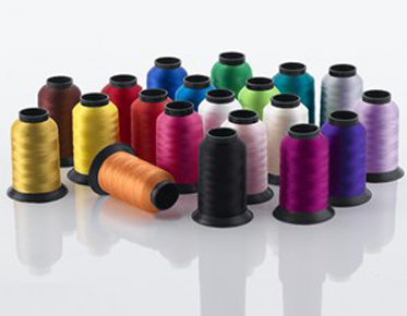
Before committing to your thread color choices, it's a good practice to test them out. Most embroidery thread manufacturers offer color charts or sample packs that you can use for reference. Additionally:
● Color Swatches: Create small embroidery swatches using the selected colors to see how
they look together. This can help you assess the overall harmony and balance of
the palette.
● Lighting Conditions: Examine your color swatches in various lighting conditions, as colors
can appear differently in natural light, indoor lighting, or under artificial
light.
● Background Fabric: If possible, place your color swatches on a piece of the actual fabric you'll be using to ensure they harmonize with the background.
6. Seek Inspiration
Don't hesitate to seek inspiration from various sources, such as art, nature, fashion, or even other embroidery projects. Look for color combinations that catch your eye and align with your project's theme. Inspiration can come from anywhere, so keep an open mind and be willing to experiment.
7. Use Color Tools
There are online color tools and apps that can assist you in selecting complementary or harmonious color schemes. These tools often provide color palettes based on color theory principles. Some popular color tools include Adobe Color Wheel, Coolors, and Paletton.
Examples of Thread Color Selection
To illustrate the importance of thread color selection, let's explore a few scenarios and the color choices that could enhance the final embroidery:
Scenario 1: Floral Embroidery
Imagine you're creating a floral embroidery design on a light blue linen fabric. The main motifs are vibrant red roses with green leaves and stems. Here's how you might approach the thread color selection:
● Main Roses: Choose shades of red and crimson for the roses. The varying shades can
add depth and dimension to the petals.
● Leaves and Stems: Opt for various shades of green to capture the natural hues of leaves.
A mix of light and dark greens can create contrast and realism.
● Background: Stick to a lighter shade of blue that complements the fabric. This ensures that the roses and foliage stand out.
Scenario 2: Monogram on a Wedding
Handkerchief
For a monogram embroidery project on a white wedding handkerchief, elegance and simplicity are key. Consider these thread color choices:
● Monogram Letters: Use a classic and timeless color like silver or gold for the monogram
letters. Metallic threads can add a touch of sophistication.
● Background: Stick to a subtle and delicate shade of white or ivory. This ensures that the monogram remains the focal point without overwhelming the handkerchief.
Scenario 3: Children's Nursery
Wall Art
Creating nursery wall art with an animal-themed design for a child's room allows for playful and vibrant color choices:
● Animals: For cartoonish animals, use bright and cheerful colors like primary
reds, blues, and yellows. These colors are visually stimulating for children.
● Background: Choose a soft pastel color like light pink or baby blue for the
background. Pastels create a gentle and calming atmosphere.
● Details: Add small details and accents using contrasting colors to make the animals pop. For example, use black for the eyes and outlines.
Maintenance and Storage of Embroidery Threads
Once you've selected your embroidery thread colors and completed your project, it's essential to properly maintain and store your threads. Here are some tips to keep your threads in optimal condition:
● Thread Organization: Use a thread organizer or storage box to keep your threads organized
and tangle-free. Label the compartments with the thread color codes for easy
identification.
● Avoid Direct Sunlight: Store your threads away from direct sunlight and extreme temperatures,
as prolonged exposure to sunlight can cause fading.
● Keep Thread Ends Secure: When not in use, secure the loose ends of your thread spools with
thread holders or clips to prevent unraveling.
● Thread Condition: Check the condition of your threads before using them. If you notice
any fraying or damage, it's best to replace the thread to ensure smooth
embroidery.
● Thread Storage: If you have a large collection of embroidery threads, consider storing
them in a cool, dark, and dry place, preferably in a thread cabinet or drawer
designed for thread storage.
● Thread Brands: Stick to reputable thread brands that offer colorfast and durable threads to ensure the longevity of your embroidery projects.
Conclusion
Embroidery thread selection is a vital step in creating captivating and visually appealing embroidered pieces. Understanding color theory, considering the project's purpose, analyzing the design, and testing color combinations are all essential aspects of making informed thread color choices. Whether you're working on a decorative piece, a gift, or a functional item, the right thread colors can elevate your embroidery to a new level of artistry.
Remember that embroidery is not just about the
final product; it's also about the creative journey and personal expression.
Don't be afraid to experiment with different color combinations, seek
inspiration from various sources, and let your imagination run wild. With the
right thread colors and a touch of creativity, you can transform fabric into a
canvas for your artistic vision, making every embroidery project a masterpiece.


